Device, Desktop or Dead Tree?
post by Chris Curran on June 22, 2009 Catch up on the Building a CIO Dashboard Series: Part 1, Part 2
Now that we have a few questions answered - do I really need a dashboard, what questions will it answer and what type of dashboard we need, we can discuss how to deliver it.
This post will cover the 3 channels through which a dashboard is presented:
- Devices - Blackberries, iPhones and other mobile devices
- Desktops - browser based dashboards and other stand-alone dashboard tools
- Dead Trees - paper-based dashboards
Some automatically move to the desktop delivery of dashboards since it is the most data-rich and visual of the options (and most fun for the developers to play with?). However, if our objectives are to use the data for decision-making and to influence behavior, then we need to think about delivering it in a way that will maximize the chances of it being regularly read.
I don’t know about your organization, but I don’t know many whose senior leadership has the time or patience to sit down and explore a desktop-based dashboard. So, I propose looking at the options by the audience as follows.
| Channel | Non-IT Audience | IT Audience |
|---|---|---|
| Device |
BEST Appropriate for senior business and IT leaders in a Blackberry (or other device) culture |
GOOD Works well for distributed IT leadership teams |
| Desktop |
ONLY SPECIAL CASES Lower priority for Non-IT audiences |
GOOD Works especially well when the dashboard is integrated into the tools/browser in which the IT audience does their work |
| Dead Trees |
GOOD Useful if used in conjunction with management briefings and when management carries folders, notebooks, etc. |
USE AS BACKUP IT should always look for opportunities to communicate. So any dashboard should have a 1-page paper version so that it is readily available. Doesn’t need to be the primary delivery method though. |
In summary, consider mobile device delivery for non-IT audiences. For IT audiences, the use of intranet or Sharepoint sites will determine how much emphasis is put on desktop delivery. Always consider paper dashboards for easy carrying and sharing with stakeholders.
BOTTOM LINE: Don’t let vendors tell you that you need a fancy graphical tool to build a dashboard. That will hurt you more than it will help. Especially for a non-IT audience.
In the fourth and final CIO Dashboard post, I will cover some challenges and final thoughts.
Sample CIO Dashboards
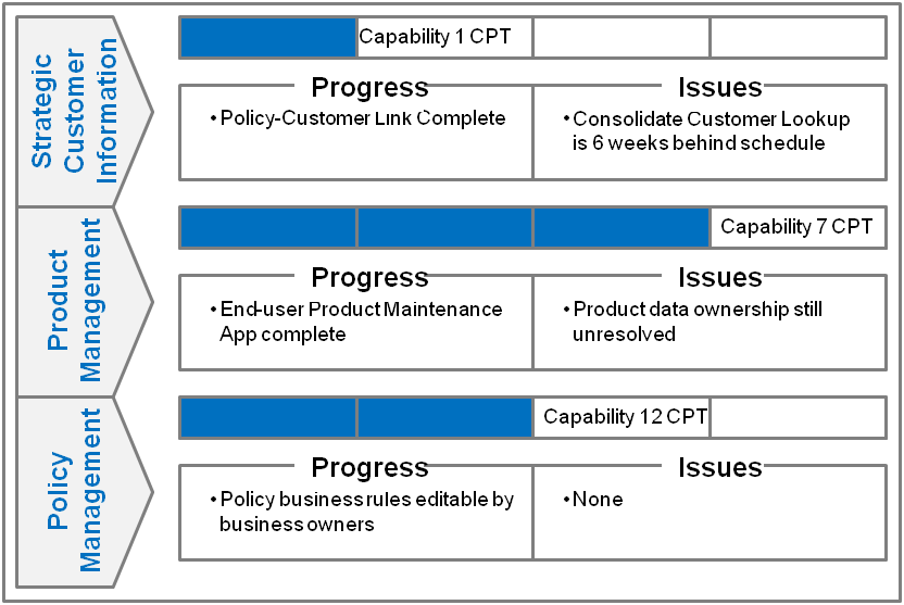
Business Value Creation Report - Healthcare
- Purpose: show progress in delivering business capabilities identified during a strategic enterprise architecture planning project
- Audience: Non-IT, business unit leaders, functional/process heads
- Characteristics: longer than 1 page and could be easier to read
- Delivery: paper (via Powerpoint)
- Comments: uses language that business stakeholders are familiar with and little IT jargon; in use for 3+ years

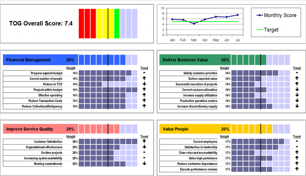
IT Service Dashboard - Insurance
- Purpose: show overall progress toward stated IT objectives
- Audience: IT steering committee (Non-IT and IT)
- Characteristics: 1 page and visually appealing, requires some decoding
- Delivery: paper (via Powerpoint)
- Comments: contained over 30 metrics, many of which were compiled using custom metrics and formulas which made this very manually-intensive

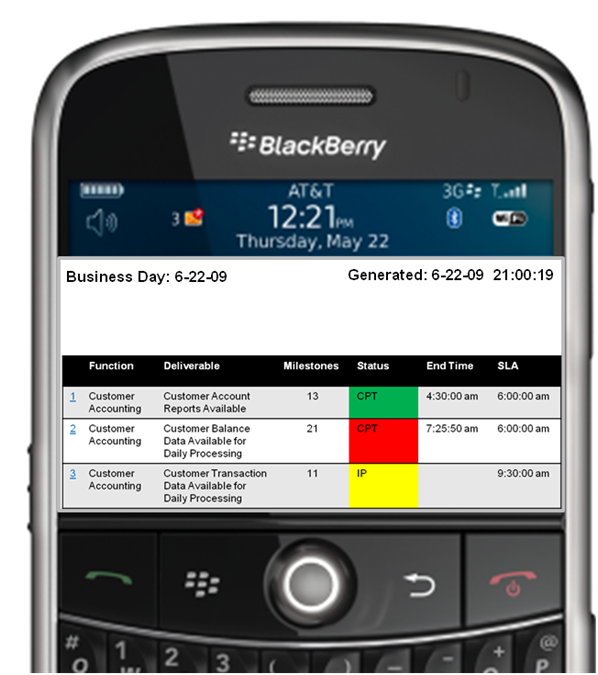
Critical Transaction Dashboard - Banking
- Purpose: highlight processing status and issues with key customer oriented functions
- Audience: business and IT function heads
- Characteristics: simple and uses business language
- Delivery: Blackberry (primary), browser (secondary)
- Comments: mobile dashboard was very critical in a high-volume 24×7 financial markets business; ability to drill into detail for any dashboard item.

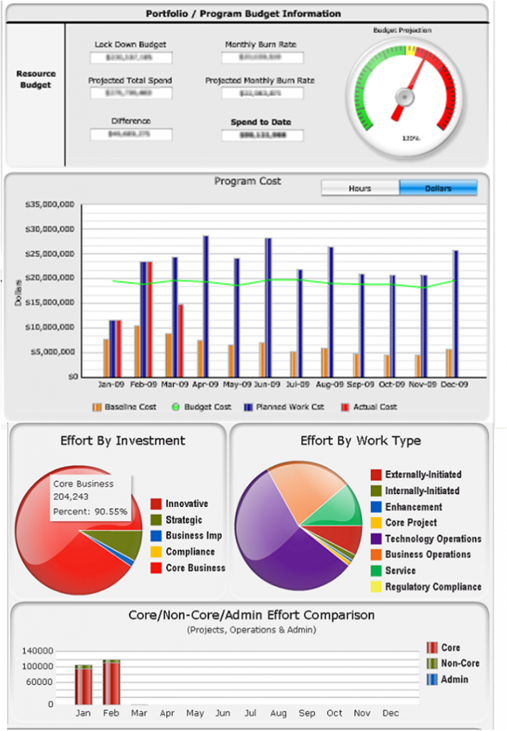
IT Portfolio Dashboard - Insurance
- Purpose: provide a broad view into project investments managed by IT
- Audience: COO, CFO and IT leaders
- Characteristics: simple layout and visually appealing; too many tabs and detail to promote summaries
- Delivery: browser and specialty tools (eg, Business Objects, Crystal Xcelcius, Compuware Changepoint)
- Comments: extensive effort to develop this dashboard but once done, the information was used daily by most stakeholders


Pingback: CIO Dashboards - 4 Types — CIO Dashboard()
Pingback: Measuring Your IT Portfolio — CIO Dashboard()