Design a Management Dashboard in 7 Steps
post by Chris Curran on June 14, 2010Guest post by Mark Vovsi
I’d like to walk you through the management dashboard design process my team recently used to build a loyalty rewards program dashboard.
It is an iterative approach with prototypes that has 2 benefits. First and most importantly, it will allow the dashboard audience to make sure it answers the right questions. Second, the dashboard team will be able to quickly assess feasibility and translate the business needs into data and technical requirements.
Since a management dashboard is a summary view using graphs, charts and heat maps, visuals should be included early on to simplify and speed the design process.
The 7 Step Management Dashboard Design Process
1. Create a dashboard shell
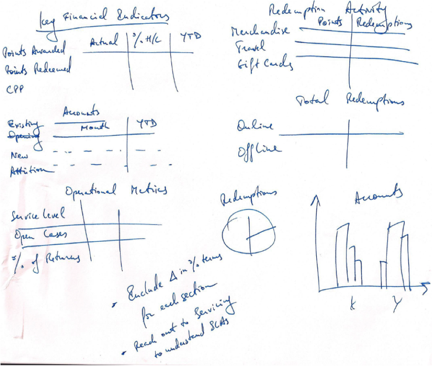
After understanding the purpose of the dashboard, create simple mockups as soon as possible to drive discussions with the teams. Don’t waste time - get creative, think out loud, and use a white board in your initial meetings!
- With a business executive, make sure that all key functions and levels of information are represented (e.g. new accounts, reward redemption trends, operational metrics). Ask the marketing executive (in our example) which decisions she wants to make for each function. Then talk through the metrics that will allow her to make those decisions
- With IT, make sure that it’s actually feasible to obtain this data. Will the team be able to automatically aggregate all data using an in-house reporting solution? If not, is the management dashboard customer willing to invest in custom development or will someone be preparing it manually every month? Answering these questions will help to define the scope and associated cost of the dashboard effort early.
2. Fill in the shell with metrics
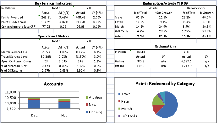
After the initial discussions, create a more complete prototype to facilitate the remaining design discussions. Draft up this prototype in Excel and include some real metrics.
Further refine and structure the design:
- Define the categories for each dashboard section (e.g. for reward redemption, the marketing executive may want the numbers broken out by Merchandise, Travel, Gift Card redemption)
- Define the columns (e.g. for a monthly dashboard - current month, trend from prior month, YTD data, and % of total are common columns)
- Fill in with realistic metrics and make sure that the data ‘adds up’, since you’ll be using this prototype to verify how the data is laid out.
- Review this prototype with the business users. Is it answering all key questions? Should the data be categorized differently? Is there a need for a ‘level 2’ dashboard with more detail?
- Update after the discussion and discuss with IT. Is it possible to aggregate and graph the data according to the business needs?
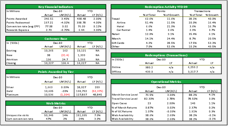
- After these alignment sessions, the revised mockup may look like this:
In our client case example, key sections and metrics were clarified, and the business team decided to not even include any charts in the final dashboard.
3. Demo the dashboard
By this point, both business and technology teams are familiar with the needs, but both sides likely have outstanding questions. It’s a good idea to talk through the dashboard requirements after demoing with a live reporting tool. Having the visual provides context around capabilities (e.g. drag and drop, dynamic vs. static). The visual demo will set expectations with users for what they’re getting and build confidence. The demo may showcase certain capabilities (e.g. charting) that present a more powerful way to communicate information.
You’ll also notice that the dashboard development team often thinks and communicates in the language of the reporting tool. The team will use the demo session to validate certain assumptions with the business and to translate the needs into their development mental model.
4. Conduct a detailed requirements session
Get the business and technology folks together, get into the weeds, and make sure that the development team understands all calculation. Document the calculation formulas.
5. Follow an iterative development approach with business users
During development, make sure that there are 3-4 prototype sessions w/users, where the business team can validate format and calculations. It’s also helpful to have the business acceptance testers get raw data that they can manipulate and sum up to make sure the dashboards show what’s been intended.
6. Validate the dashboard with a cross-functional team
Management dashboards and reports are a funny thing - true needs always seem to be determined after they’re already in use. Prototyping will help, but it’s not until the dashboard is used in the board room, that it becomes apparent, that some metrics are unnecessary, while some are missing. It may help to hold a soft launch and listen in on a few “live” meetings to see how the dashboard is used.
7. Plan for updates
After the dashboard is launched, keep the development team engaged part time at least for 3 months in case there are revisions or it becomes apparent that certain dashboard sections need to be displayed in greater detail (level 2 detail).
These seven steps worked well for our team. One dashboard lesson learned is to ensure that the person driving the design process has the skill set to both guide an executive through defining the dashboard requirements of the dashboard and also have a solid understanding of existing reporting capabilities and available information.
For further reading, check out the CIO Guide to IT Dashboards.
cc licensed flickr photo shared by Scott McLeod
-
Oliver Halter
-
Oliver Halter
-
Reggie Panaligan
-
Bob Norton


