The 4 Types of CIO Dashboards
post by Chris Curran on June 15, 2009Read Part I of the Building a CIO Dashboard Series

I think the biggest challenge in building a meaningful CIO dashboard lies in the question of what to measure. As my partner Jim Quick says it’s either feast or famine when it comes to measuring IT. You either have so much data you don’t know where to focus or you are paralyzed by the idea of figuring this out.
In keeping with the best iterative design practices, I’ve altered the structure of this series of posts about building a CIO dashboard. The design topic actually deserves two posts, so this one (part 2) will center on what to measure and the next one will look at different display techniques.
Audience Matters
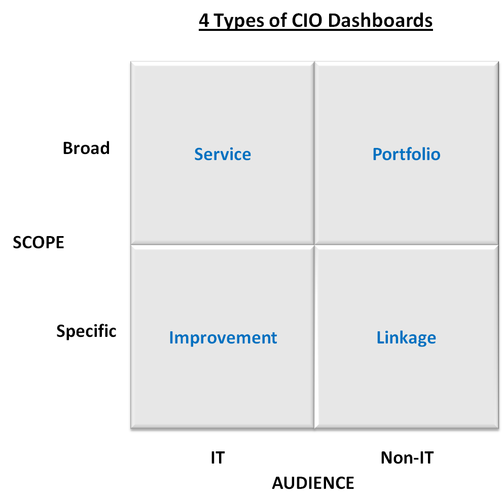
Given the range of questions that can be addressed, maybe the most important way to narrow down your measurement choices is by considering your audience. I don’t think there will be much argument that there are some things important to IT that the non-IT audience won’t care about or understand. So let’s define two broad audiences that way.
When I think of a dashboard, I think of a broad set of gauges that tell me how my car is performing, how it’s using its resources, the status of the interior and exterior environment and if there are any issues. Today’s car dashboard is actually a great metaphor for the CIO dashboard because of the degree of abstraction required to summarize all of the on-board computers and sensors. But since there are so many things to measure, creating a meaningful AND broad dashboard is a significant, but doable challenge.

So, a second way to discuss the choices of metrics is to determine the scope to be measured - broad across all of IT or more specific to a program, business area or set of business objectives. With audience and scope as our two dimensions in the ubiquitous 2×2, we can discuss the 4 types of CIO dashboards.
Portfolio Dashboard
For those organizations who have adopted the portfolio management philosophy, a portfolio dashboard can make a lot of sense. In fact, the country’s new CIO, Vivek Kundra, is planning a portfolio dashboard for the government’s technology projects.
There are two real challenges in this kind of dashboard - actually they are challenges with IT portfolio management in general:
- It is critical to embrace the philosophy that there are different types of IT projects (asset classes), each with a separate benefits (return) profile. I will write a separate post on this subject, but as an example, measuring an email upgrade using an ROI metric doesn’t make much sense. A portfolio with one asset class defeats the purpose of portfolio management.
- You must have the discipline to measure actual benefits regularly after the project has finished. I would guess that 20% of IT organizations do this sufficiently well.
Sample Measures
- Planned Projects: Projected Spend ($, %) by Project, Project Type; Risk/return by Project, Project Type
- In-flight Projects: Projected Return by Project, Project Type; Baseline vs Estimated Budget by Project
- Completed Projects: Projected vs Actual Return by Project, Project Type
Linkage Dashboard
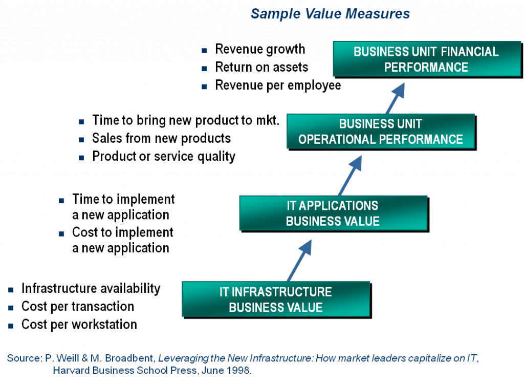
Probably my favorite way to think about and communicate IT metrics is to explicitly link them to some business metric that is important and well-known across the company. The challenge with this is to credibly link the business objective to the IT metric. There are two ways to do this:
- Develop the explicit linkage yourself. One technique for this is using Diamond’s Business Architecture approach, but other approaches exist too - Balanced Scorecard? Others?
- Rely on academic or industry research to prove a causal link between a business objective (eg, improve customer service) and an IT capability (eg, CRM system performance) and then just measure the IT performance metric as a direct impact to the business objective. This is easier but less credible. MIT’s Center for Information Systems Research has done the best job I have seen in linking business performance to various IT practices (governance, architecture, etc).
Sample Measures
The measures will depend on the business objectives, but here is an example of the linkage to give you an idea of how this could look. This is from a presentation by Peter Weill at MIT CISR.

Service Dashboard
Even though the service dashboard is oriented toward an IT audience, it if focused on organizing and presenting metrics that impact service to IT’s internal constituents.
Sample Measures
- Throughput: Business (not tech) transactions per hour/week/month and peak times
- Quality: Number and severity of feature/bug fix requests
- Satisfaction: average time to close helpdesk tickets; qualitative customer sat measures
Improvement Dashboard
I’m not a fan of a general purpose IT dashboard because it will lead directly to the “metrics feast” and a lack of focus. So, a broad IT dashboard should be oriented around IT’s 3-5 improvement goals, whatever they may be. Popular improvements IT shops seem to be focusing on these days include KTLO cost reduction, applications TCO and software reuse.
Sample Measures
- Projects: earned value metrics
- Processes: # exceptions in governance processes
- Maintenance: size and severity of backlog
- Skills: % of staff trained in core skills
I wouldn’t be offended if your dashboard mixed and matched types and metrics in the columns (Portfolio + Linkage, Service + Improvement). But I think it’s pretty important to keep things clean within each audience type.
I look forward to your feedback and comments. The next post will look at some actual examples of CIO dashboards.


Pingback: Device, Desktop or Dead Tree? Part 3 of the CIO Dashboard Series — CIO Dashboard()