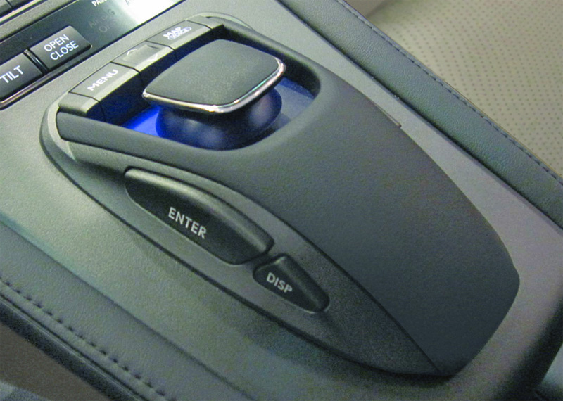
I had the chance to drive the 2010 Lexus HS 250 hybrid while my car was in the shop. While it’s good to see more hybrids hitting the road, the more interesting thing to me was the new navigation system and the controller that drives it. Aside from several mediocre dial-oriented efforts from BMW, Audi and others, most nav systems these days seem to be touchscreens, both factory installed and add-ons.

The new Lexus controller looks similar at first glance, but it’s a joystick rather than a dial and had a solid but smooth feel to it. The really cool feature, is that when you direct the mouse pointer to a control button on the UI, the controller “bumps” a bit so you know you are on the button and it feels a little “sticky” when you are over each button. This allows you to glance at the display and then guide the cursor in the general direction while focusing back on the road. When you hit the button, you feel it.
Most of us are familiar with this idea whether from the Nintendo Wii controller or the button feedback on a Blackberry Storm. This concept is sometimes called force feedback or probably more accurately, haptics. Popular Science has a nice haptics video that describes some of the applications in the labs.
Haptics in the Enterprise
Driving back home from the dealership, I wondered what types of applications would benefit from a haptics-augmented interface. The first thing that came to mind was the ATM. I really hate how most of them out there combine the hard buttons on the machine with the text labels on the screen - they never seem to line up! I think a click feedback on the ATM touch screen makes a lot of sense. Maybe they are already a few of them out there but I haven’t seen them and believe me, I’ve used just about every ATM in major airports.
Digging a little deeper, what types of applications require the user to focus on multiple things at once (eg, the road, navigation system) and are prone to errors? How about customer service applications - maybe those in the call center? My partner Bill Abbott who is an expert in call center productivity (and co-authors Diamond’s Information Advantage blog) says that one of the biggest and growing issues in the call center is proper coding of the reasons for calls. He says:
I think that this kind of technology could improve another problem we see that is a close cousin of error rates — miscoding. A lot of call centers have really bad reason coding for a number of reasons, among the reasons is the use of long drop down lists or radio buttons. I wonder if good haptics could improve call coding which in turn fosters great root cause analysis that in turn drives down the incident of calls (suppose you can reduce volumes with better data by 2-5%) or yields insight on reasons and significance for churn.
I’m not sure how a design incorporating haptics would address the coding problem, but I’m open to ideas. What I am sure of is that more enterprise UI opportunities will crop up that are candidates for better touch-oriented feedback systems like those on the Lexus Touch controller.
As always, I’m very interested in your thoughts and examples you have seen in practice. Thanks for reading.
Did you enjoy this article? Please subscribe to CIO Dashboard to receive the latest posts!


Pingback: Tweets that mention Can Haptics Touch the Enterprise? — CIO Dashboard -- Topsy.com
Pingback: 8 Intriguing User Interface Designs from the MIT Media Lab — CIO Dashboard